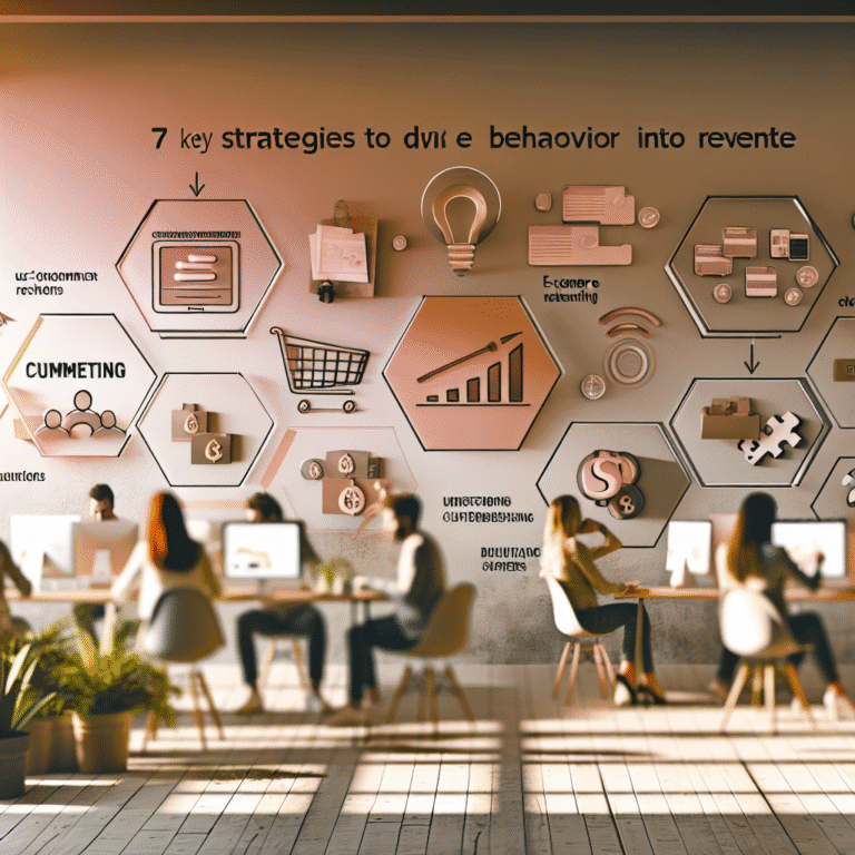

Behavioural Insights for Better Ecommerce Growth
Imagine for a moment: your dashboard is buzzing like the cockpit of a spaceship. Every click tracked, every journey mapped, every product polished to perfection. Yet, it's Thursday, sales are snoozy, and your shoppers vanish faster than my first pint in the pub. Ah, the sweet enigma of ecommerce. Data's all over the place, but sometimes trying to understand customer behaviour is like trying to smell the colour blue.
Why isn't data enough? Because numbers tell you what folks are doing, but not why they're doing it. That's where behavioural insights come in, offering the juicy context to your dry statistics. Let's shift our designs from machine-minded to human-hearted.
Data Tells the What, Not the Why
You're swimming in data:
- "Bounce rate's rocketing."
- "Cart abandonment is up 12%."
- "Audience A loves Button B."
Helpful? Sort of. Comprehensive? Not a chance.
The classic data-driven approach often misses the human story. Real people aren't algorithms. They're gloriously unpredictable, and yet so predictably human. Consider traditional data's blind spots:
- A high bounce rate shows they left, but not if it was confusion, scepticism, or because their microwave dinged.
- Cohort analysis tells you who avoided buying, but not whether a clunky interface or awkward stock photo turned them off.
- Sure, you can A/B test all the button colours, but it won't make lifeless copy sing.
Take this gem: a fashion company pumped up signups by 42% simply by trimming their form — from 9 fields to 4. They didn't rely on instinct but on a thing called cognitive load theory (cheers, John Sweller). That’s the clever art of behavioural design at work.
Ten Ways Behavioural Science Boosts Conversions
These insights aren't stabs in the dark; they're science-backed nudges that drive results. The human mind might seem barmy, but it follows curious patterns. Here's how to align with those quirks.
1. Loss Aversion
We hate losing more than we love winning. A cheeky tweak like "Don’t miss 20% off" often beats "Get 20% off".
2. Anchoring
The first number becomes the mental yardstick. "Was £129, now £89" magically makes £89 a bargain.
3. Social Proof
No one wants to be prototype number one. "1,200 people bought this today" reassures like a friend’s recommendation.
4. Cognitive Ease
Mental overload kills trust. Keep the design clean and the text clear — it does wonders.
5. Reciprocity
Be generous first. Size guides, quirky quizzes, or free samples create a feeling of "I owe you".
6. Scarcity
"Hurry, only 3 left!" Use wisely, and it adds urgency — clarity even.
7. Framing Effect
Context changes perception. "Shipping = £15" stings, while "Premium tracked shipping only £3 more" feels delightful.
8. Commitment Bias
Small steps lead to bigger leaps. Saving an item often nudges people to eventually buy.
9. Defaults and Nudging
Make good choices easy. Automatically select "fastest shipping" or "most popular size" to smooth their path.
10. Sunk Cost Fallacy
If they've entered billing, they're more likely to click purchase — progress bars keep them pressing on.
These principles transform each interaction into a powerful conversion tool.
Practical Tips to Apply Behavioural Design in Ecommerce
Here's how you can weave these ideas into your existing ecommerce strategies.
Homepage
- First impressions matter: Show local deals and tailored picks.
- Social proof upfront: "Over 150,000 5-star reviews" beats "Your travel essentials".
- Rewards waiting in the wings: Remind them how close they are to free shipping.
Product Pages
- Anchor perceptively: Display the full price slashed through.
- Add micro-influences: "674 views today" adds excitement.
- Calm scarcity, don't shout: "In high demand" works better than "LAST ONE LEFT!!"
Cart & Checkout
- Reframe, don't cost: Swap "£3.99 Shipping" for "Tracked shipping from £3.99 — worry-free".
- Preselect smartly: Default to reliable shipping or insurance options.
- Progress leads the way: "Step 2 of 3" ensures they're nearly there.
Email and Retargeting
- Pitch with perspective: If they bounced, follow up with a different angle.
- Segment with smarts: Confidence seekers need reassurance, not urgency.
Reviews and Ratings
- Visibility near action points: Don't hide them in the footer.
- Offer dynamic insights: If hovering over "durability", show rave reviews on quality.
Mobile UX
- Cut friction, save visits: Keep menus concise. Bigger buttons, shorter forms.
- Plant commitment seeds: Let users easily save or wishlist.
Proven Success Stories
Marrying behavioural science with data transforms ecommerce. Take these examples:
- Booking.com plays on scarcity and FOMO expertly: "Only 1 room left at this price", or "Booked 12 times today". Persuasive indeed.
- Graze.com harnessed reciprocity by offering free snack boxes. Their list and sales skyrocketed.
- ASOS Outlet uses pricing anchors adeptly: original price, outlet discount, time-limited deal. Buying feels like victory.
The result? More sales, more value. All down to brain-smart strategies in ecommerce.
Are We Manipulating?
Only if you're pretending to offer value. With honesty, these insights reduce mental clutter and aid confident buying. You're not tricking anyone; you're simply streamlining their choices, making it easy to say "yes".
Designs built on behavioural science aren't about pressure. They're about empathy and clear intention.
Conclusion
Each click hides a human decision. Stop building for bots — start understanding the feeling behind the stats. The next time you spot a spike in bounce or a dip in conversions, ask, "What's the human emotion here?"
Redesign for psychology, not just performance. You're not merely a marketer or strategist. You're an architect of human behaviour. Treat numbers as signals of sentiment, and watch your sales funnel flow like a well-poured pint. And trust me, that brings results.