Turning Pretty E-Commerce Sites Into Profit Machines
You've got a sleek online shop, your inventory is bursting, and your digital ads are vying for attention. Yet, sales? They're flatter than a pancake. Usually, it's not the pricing or the products to blame. It's likely your site's design, paying too much attention to looks and not enough to what customers actually do.
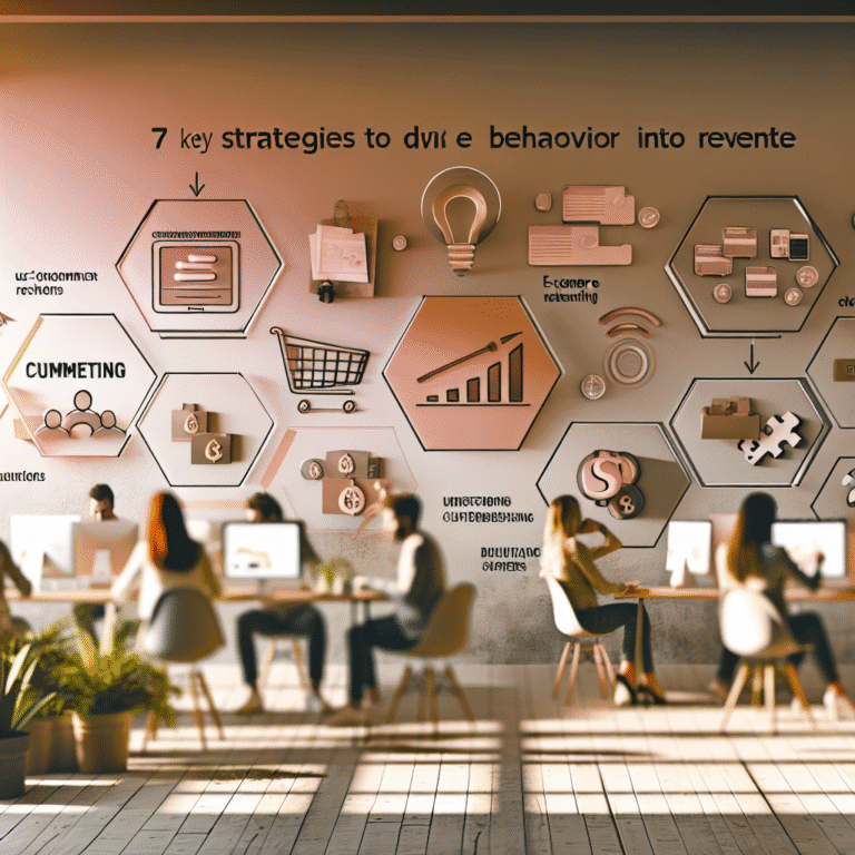
Here's where data-driven design steps in. Think of it as the no-nonsense friend that says, "Sure, your site looks great. But does it work?" When we start designing based on what people do, rather than what a brand book says, sales can take off.
Understanding Data-Driven Design in E-Commerce
Imagine a design approach that doesn't simply go for pretty pictures. It uses facts — real ones like clicks, scrolls, and where folks drop off — to create every button and layout. E-commerce design is a bit like psychology; you've got to know how people feel at each click.
Craft a solid strategy by using the following:
- Heatmaps for understanding which areas get attention
- Session replays to see user paths
- Funnel analytics for spotting conversion leaks
- On-site surveys asking what went wrong
- A/B tests to decide based on proof instead of office politics
This isn't about stifling creativity; it's about nudging it in a productive direction.
What to Monitor Before Revamping Your Online Shop
Redesigning without data is like assembling IKEA furniture without a manual — you might end up in a world of pain. Before redesigning, pay attention to these behavioural clues:
- Heatmaps showing where users rage click or ignore
- Session recordings displaying user hesitation
- Funnel analytics pointing to where shoppers abandon you
- Micro-interactions showing which buttons are hot or cold
- Feedback from tools like Usabilla asking users what's confusing
And remember, folks on mobiles and desktops play by different rules. What works on one might baffle the other.
10 Smart UX Moves to Transform E-Commerce Design
Now, let’s put those numbers to work and transform visits into sales with a few clever tactics.
1. Simplify Site Navigation
If most of your menu goes untouched, it’s just clutter. Design menus that make decisions a breeze — minimalism with purpose.
2. Design Hero Sections to Guide Users
Fancy banners are lovely, but if everyone’s skipping to “Bestsellers,” that’s your cue. Use heatmaps to direct interest to where it naturally goes.
3. Use Scroll Data for Key Content Placement
Most mobile users never read as far as you'd hope. Put the important stuff — like size guides and value props — front and centre.
4. Enhance Calls to Action
Bland buttons lose sales. Revamp your CTAs with contrast and position them close to where decisions get made. Stronger words like "Get Yours" work wonders.
5. Reduce Anxiety with Smart Microcopy
Switch intimidating labels like "Buy Now" to softer cues like "Reserve Yours". Such tweaks can boost sales because words truly matter.
6. Get Rid of Carousels
Rotating images seldom work; if nobody clicks past the first slide, it's time to ditch them.
7. Improve Site Search
If customers use search but don't buy, you've got a design blip. Add features like typo tolerance and visual suggestions to make it intuitive.
8. Design Frictionless Cart Pages
Ease user uncertainty by adding security badges and clear shipping details. Creating a relaxed mood leads to checkouts.
9. Personalise Based on Actions
If someone’s always looking at rain jackets, start showing them more wet weather gear. Tailor the experience without being intrusive.
10. Tweak Checkout Layouts
No single checkout works for everyone. Test out different layouts and see which boosts your conversions the most.
Avoid Guesswork With a Real Case Study
A UK brand selling pet supplements saw half its users vanish at checkout. Various teams wanted different fixes. But the real problem? The PayPal button was hidden. Moving it up increased conversions by 22%. Proof that a tiny change can spark big results.
It's About Your Customer, Not You
Your shop isn't your creative playground. It’s a tool for how real people think and shop. Great design anticipates problems and smooths out uncertainty. With today’s analytics, tweaking page by page using hard data is a breeze.
Design for people, not boardrooms. Make your site so intuitive it practically sells itself. And, in the end, look beautiful doing it. Here's to an online store that doesn't just look the part but pays for itself too.