Nudge Your Way to Better Ecommerce
Ever wondered why your online shop, though a marvel of speed and good looks, just isn't raking in the dough? Well, it's not about having the flashiest features. It's about coaxing the shopper's brain into action. And sometimes, it all comes down to where you plonk those products on the page.
The Power of Where You Place Stuff
Folks aren't browsing. They're racing through your pages like they're on a mission. Most of them, scientists say, scan screens in an F-pattern. So, if your top product is lounging at the bottom, you might as well put up a "Closed" sign. Positioning isn't just a pretty face; it's a conversion lifeline.
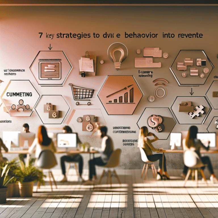
Ten Brainy Tricks to Boost Your Sales
You don't need a degree in consumer psychology. Here's your toolkit of ten nifty tricks to use when you're lining up those products.
Anchoring Bias
Kick things off with your priciest item. It sets the price pace. After that, everything else looks more of a bargain.The Decoy Effect
Throw a less appealing option into the mix. It makes the one you want them to pick look much juicier.Loss Aversion
People fear missing out. "Only 2 left!" sparks action like no one's business.Visual Salience
Design leads the eye. Use whitespace wisely and top-left prime real estate for your big hitters.Social Proof
"Bestseller" or "95% loved this." Let's face it, we're all a bit sheep-like.Authority Bias
Display those expert nods. Stars, badges, and trusted voices get their attention.The Mere Exposure Effect
Show your wins repeatedly. Familiarity breeds fondness.Choice Architecture
Too many choices can befuddle. Offer fewer, well-curated options.Priming
Context is king. Show that jacket on someone stylish, not as a flat lay.Emotional Framing
People buy feelings, not specs. Sell them the dream, not the detail.
How to Place Products for Maximum Impact
Now, let’s put those nifty tricks to use. These tips are simple to implement and pack a punch when combined.
Start with the Anchor Product
Begin with that expensive dazzler. Everything that follows will look a steal.Add Decoys Wisely
If you've got two options, slip in a third, less tempting choice to guide them.Highlight Stars in the Grid
Make bestsellers pop with prime positioning and larger images.Suggest Complementary Offers
"Looks good with…" is better than thrusting bundles at customers.Use Your Whitespace Like a Pro
Luxury speaks in space. Make room around your hero products.Repetition with Variation
Show the same product in different lists but vary the order to keep it fresh.Gentle Urgency
"Only 3 left" reads better than a flashing red countdown. Less panic, more urge.Pair Trust with Action
Stick a credible badge near your "Add to Cart" button for those on the fence.Prime with Lifestyle
Make sure product images aspire. They should sell a lifestyle, not just an item.Lead with Emotion in Descriptions
Talk benefits before details. Make them feel the desire before you show the specs.
Small Changes, Big Wins
- Keep the “Add to Cart” easy to spot and accessible.
- Limit choices to make decisions simpler.
- Group accessories in threes for balance.
Wrapping Up
If you want to up those sales, think like a behavioural strategist, not a stock shuffler. Each choice of placement, style, and word is an opportunity to nudge, not shove, your shopper towards buying. It's about being smart, not just slick, so every pixel does its job to push sales into high gear.
So go on, give it a go. After all, you're not just running a shop—you're designing decisions.