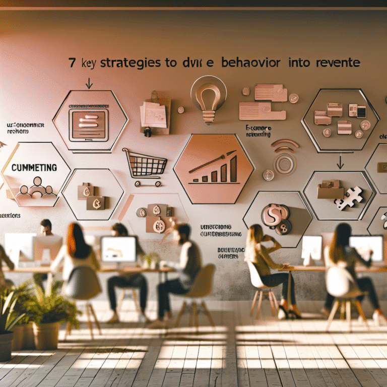

Give Your E-Commerce a Brain Boost
Right, so here’s the scene: your site visitors? Plenty. Your product pages? The clicks are almost deafening. Your ads? They're practically pulling double shifts. But conversions? As scarce as hen's teeth. What happened?
It’s not your price tags nor your platform, but pure, delightful psychology.
People don’t think like spreadsheets. They say they want options but then freeze when faced with too many. They talk value, but snatch up whatever seems like it’s running out. Smart e-commerce brands that know this dance see better results.
Curious how the boffins do it? Here’s a handful of psychology-driven tricks to help nudge those site visitors into shoppers.
Why Your E-Commerce Needs Psychology
Repeat after me: your shoppers are human, not robots.
They make a whopping 35,000 choices a day and use mental shortcuts to avoid feeling frazzled. That’s where psychology swoops in to save the day, easing buyer uncertainty and creating the nudge they need to carry on.
Customers follow feelings, not funnel diagrams. These tactics cater to those key moments that make a big difference.
Use Anchoring to Show Value
Nobody really knows what anything "should" cost, so what do they do? They compare. Set a high-priced item as a benchmark. A £600 coffee maker makes a £249 one look positively thrifty.
Take a leaf out of Made In’s playbook. They put a £620 pro bundle side by side with a £195 starter kit—boosts conversions like you wouldn’t believe.
Place Social Proof Where It Matters
Social proof is gold, but get the timing right. Toss it next to hesitation spots:
- Below the "Add to Cart" button: “4,821 folks bought this recently”
- Next to images: “Worn by @lucylovesfashion”
- In exit pop-ups: “12 others are eyeing this right now”
Show others are keen too, and your add-to-cart button will soon be singing.
Simplify Choices to Make Decisions Easy
Too many options can leave your shoppers stuck in a mucky decision paralysis. Go for clarity:
- Trim down to 3-5 core options
- Use images instead of dropdowns
- Provide guidance like “Best for Beginners”
This makes life easier for your shoppers, helping conversions come naturally.
Use Scarcity, Honestly
Faux urgency is old news. True scarcity taps into the real fear of missing out:
- “Only 2 left in medium”
- “Selling fast, shipping in 5–7 days”
- “Limited batch available, grab it while you can”
ASOS upped their game by showing off when stock was low, without being sneaky about it.
Turn Shipping into a Win
Shipping costs often seem like an annoyance. But with a change of tack, you can turn it into a positive step:
- “Just £7.20 away from Free Shipping!”
- “Free Next-Day Shipping on your first order”
- “3,812 chose Express Delivery Today”
Frame it as moving forward, not a necessary evil.
Build Momentum with Micro-Actions
Small actions lead to commitment. Get folks started and they’ll want to finish:
- Use progress bars like “Step 1 of 3”
- Pre-fill info for returning folks
- Ask for little opt-ins early on
Help shoppers feel like they’re nearly there, and they'll stick with it.
Play on Loss Aversion
People hate losing out far more than they love gaining. So phrase things smartly:
- Avoid “Get 10% Off Today”
- Try “Don’t Miss 10%—Expires Soon”
This switch in wording makes them think twice about letting go.
Set Smart Defaults
Defaults are powerful; most folks don’t bother to change them:
- Pre-select quicker shipping or store credit
- Automatically subscribe for deals, but do it properly
- Auto-select frequent sizes or options
Defaults should ease decisions, not push them.
Banish Doubt with Trust Marks
Risk is the conversion killer lurking in the background. Trust signals make buyers feel safe:
- Show Norton or McAfee badges during checkout
- Add “Free 90-Day Returns” near important buttons
- Use well-known partners like PayPal
Each cue helps knock down invisible barriers.
Get Shoppers Engaged with Quizzes and Tools
Interactions feel like ownership, and that’s the IKEA effect in action:
- Product matching quizzes
- “Build Your Bundle” options
- Guides that adjust to user choices
Function of Beauty’s haircare quiz is a perfect example, where customisation equals commitment.
Tie Promotions to Fresh Starts
Dates have power; people love a clean slate. Think:
- New month: push fitness gear with fresh goals
- Seasonal swaps: suggest wardrobe refreshes
- Back-to-school: handy for planners or desk bits
It’s like offering permission to try something new, and it works wonders.
Tell a Story, Not Just the Specs
Forget bland fact lists. Instead, tell a story about your product:
- Not “Stainless steel pan”
- Try “Pan for 2,000 family dinners and midnight snacks”
People remember stories far better than stats.
Re-Engage Thoughtfully
Abandoned carts aren’t the end; they’re a pause button:
- “Still thinking it over? Your 10% off is leaving soon”
- Create easy paths back to their cart
- Use engaging imagery that rekindles interest
Help them recall why they liked it in the first place.
Conclusion: Understanding Minds Boosts Conversions
Apply behavioural insights to your e-commerce site—it’s not a gimmick, it’s savvy.
People zigzag through emotions and whims, not straight lines. Brands that get this give customers a seamless experience.
Start with one tactic, see how it goes, then try more. When you get why people buy, you naturally boost conversions.
It’s not just about selling. It's about making connections.
Trust does the converting.