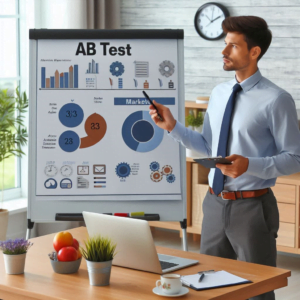
In the online shopping space, even tiny changes can lead to big improvements in how well a website performs. Simple A/B tests show just how these small tweaks can make a big difference in getting visitors to buy something.
As online shopping grows, companies need quick decisions backed by data to remain ahead. A powerful tool at their disposal is A/B testing. This involves comparing two versions of a webpage or feature to figure out which one works better. Using this method can dramatically enhance sales, keep visitors interested, and retain more customers.
We’ll explore three case studies of A/B tests that proved successful and discuss what made them effective. Although the changes might seem minor, they led to noticeable increases in sales. If you own a business or manage digital marketing, these examples could help you boost your online performance.
Let’s get ready to learn from these real examples of A/B testing victories!
Test 1 — Call-to-Action Button Colour Change: A Simple Test That Increased Sales
Idea: It may be an a/b testing cliché, but changing the colour of a call-to-action (CTA) button might influence users and boost sales.
Test Details:
- Original Version: Green CTA button.
- New Version: Red CTA button.
- Outcome: The red button led to a 15% increase in sales compared to the green one.
Reasons for Success:
- Colour Influence
Colours affect how we feel and the choices we make without us even realising it. Online, red often feels more urgent, making users act quickly. Green, often linked to comfort, might not push users to hit “Buy Now” or “Sign Up”. - Eye-Catching
The red CTA stood out more, especially on websites featuring shades like blue and grey. In the busy online shopping scene, highlighting main features like a CTA button is quite important for increasing sales. - User Focus and Action
People often skim websites. A bright, contrasting button grabs attention, making actions clearer and easier for users.
Helpful Tips:
- Try different colours for CTA buttons. Your brand’s favourite might not always drive the most clicks.
- Leverage what colours mean. Knowing which colours prompt actions (like red for urgency, blue for trust) can make your button more effective.
- Make sure your CTA buttons stand out on your page to catch attention and guide users to act. Do not neglect the contrast between the button colour and its text.
Extra Advice: Tools like Optimizely or Monetate let you test different button colours and gather insights from A/B testing.
Test 2 — Improving Headlines: How Clear Messages Win Over Users
Idea: Changing a headline to stress value over vague words can boost user interest and clicks.
Test Details:
- Original Version: “The Best Solutions for You”
- New Version: “Save Time & Money with Our Solutions”
- Outcome: The clearer headline led to a 22% rise in click-throughs.
Reasons for Success:
- Value-Focused Words
Shoppers want meaningful benefits, not fluff. “Save Time & Money” directly addresses what users want, offering clear rewards. - Being Clear Over Cleverness
While creative wording can be appealing, clarity reigns supreme in the e-commerce space. The winning headline is direct, leaving no questions about its advantage. - Highlighting User Benefits
The headline points to common user issues and offers a solution, tapping into emotions and increasing clicks.
Helpful Tips:
- Focus on what matters most to your audience. Be direct about the benefits you provide, like saving money or time.
- Clarity over cleverness. Make sure users can instantly see what they gain by engaging with your site.
- Target common issues users face. Demonstrate how your product offers solutions to boost conversions.
Extra Advice: Apply this strategy to product descriptions and subheadings to maximise impact.
Test 3 — Adding Trust Elements at Checkout: Building Belief in Purchases
Idea: Including trust signals like safety badges and customer reviews can reduce cart drop-offs and boost sales.
Test Details:
- Original Version: No extra trust signals on checkout.
- New Version: Checkout page with trust badges, customer reviews, and free shipping info.
- Outcome: Trust elements led to an 18% rise in completed purchases.
Reasons for Success:
- Reducing Risk Concerns
Customers worry about giving payment info online. Security badges offer peace of mind about data safety, encouraging purchases. - Trust Through Reviews
Short customer reviews during checkout enhance your brand’s trust. They soothe last-minute concerns and increase purchase readiness. - Using Social Proof
Knowing that others enjoy your product reassures potential buyers. Adding this evidence near purchase time nudges hesitant users to finish buying.
Helpful Tips:
- Include trust badges on checkout pages, especially when sensitive data is asked for.
- Position customer reviews thoughtfully to build belief in your brand.
- Utilise social proof to assure buyers of your business’s reliability.
Extra Advice: Besides trust badges, simplify checkout to reduce friction and improve sales.
Conclusion
A/B testing should be a staple for any online business aiming to increase sales and perform better. Testing elements like CTA colours, clear headlines, and trust elements could make small but mighty changes.
The examples provided offer actionable tips you can quickly adopt. But remember, A/B testing is an ongoing process with room for continuous improvement. Take these tips as a starting point and adapt to learn what works best for your customers.
Start testing today and see those small changes make big differences on your online store! 🚀


